We are so excited to inform you of this most recent Astra PRO updates 3.9, and we can’t wait to explain how it will totally change the experience of your WooCommerce website.
Every part of your WooCommerce store is impacted by the most recent update. Astra PRO has significantly improved almost every aspect of the WooCommerce store, from the shop and product page to the cart and checkout page.
Let’s go over each page that has been affected by Astra Pro Updates 3.9 individually.
This review covers these pages:
👉 1 – Shop Page
👉 2 – Product Page
👉 3 – Cart Page
👉 4 – Checkout Page
👉 5 – Thank You Page
👉 6 – My Account Page
1. Shop Page on Astra Pro Updates
You’ve probably seen the Grid and List default skin layouts that come with the Astra shop page. The two exist well, but we now have a brand-new skin called MODERN.
BEFORE
AFTER
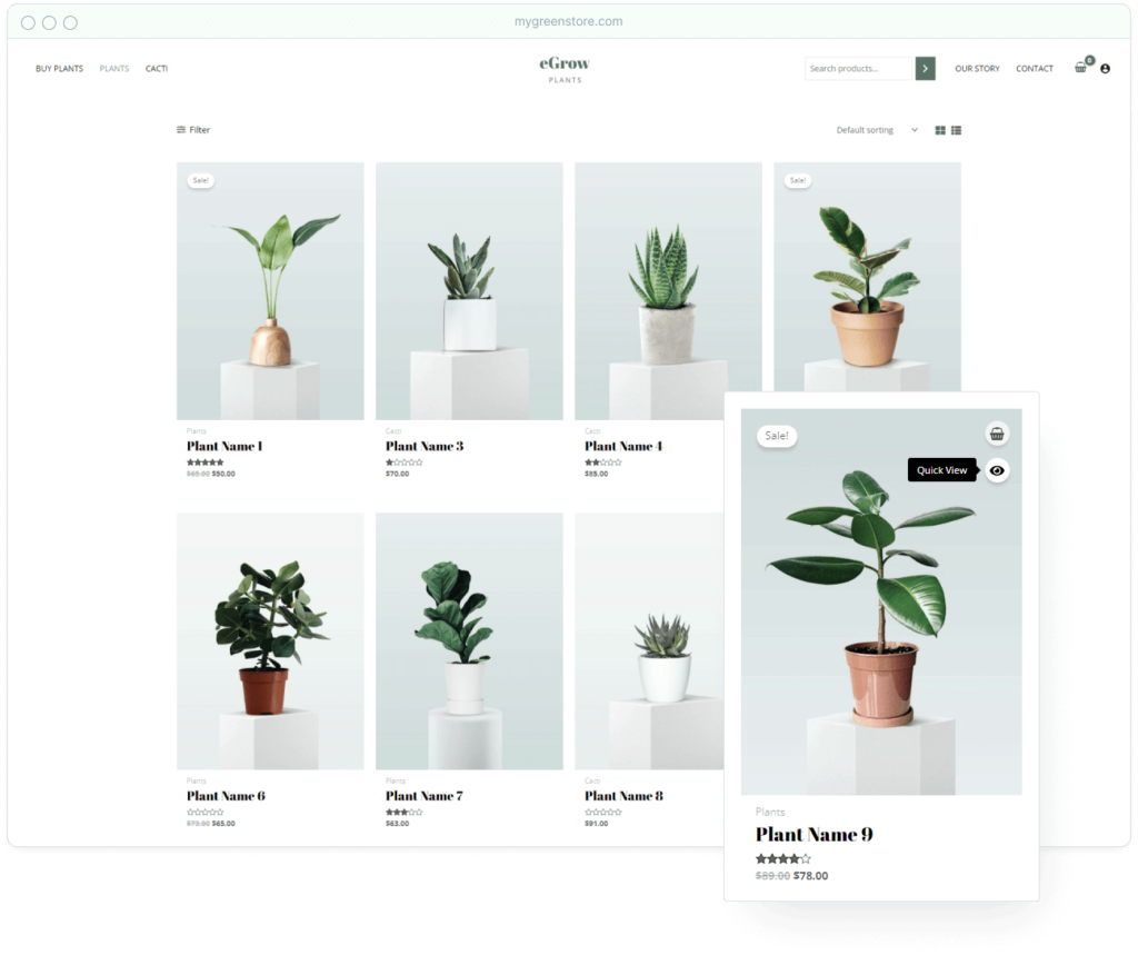
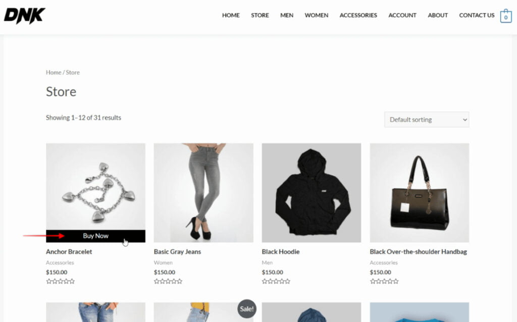
The new Modern skin looks fantastic and improves the whole shopping experience.
When you hover your mouse over the product image, the ‘add to cart’ and ‘quick view’ buttons appear. Customers can now make purchases without having to travel to individual product pages.
The finest part is that it provides virtually limitless customization choices via the customizer.
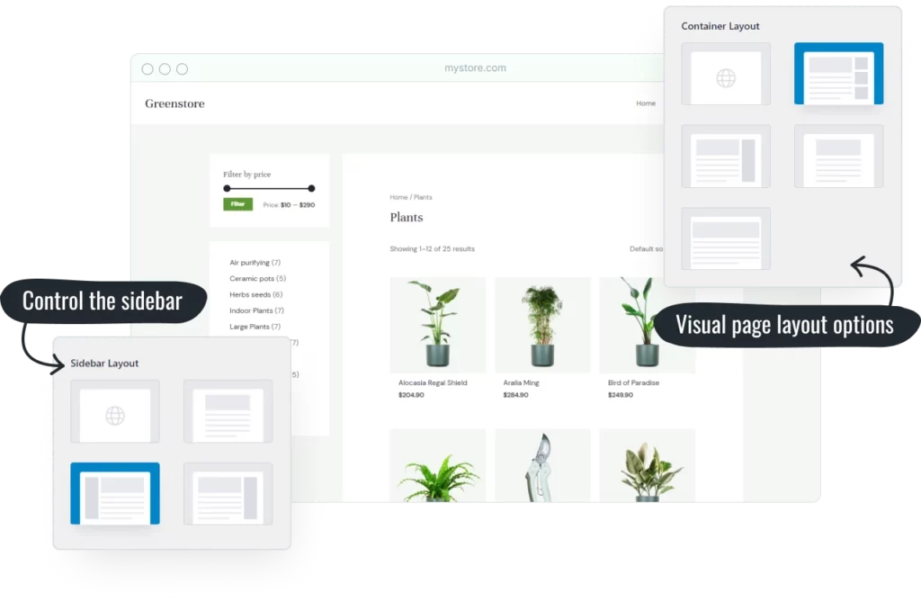
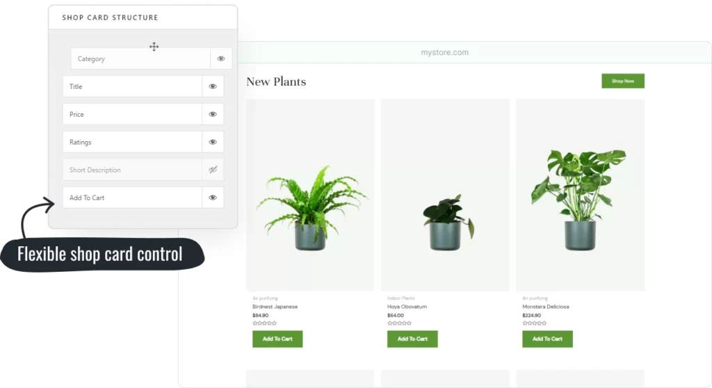
1.1 Do you like sticky menus? What about Sticky Sidebar😍?
Astra PRO 3.9 updates now include a Sticky Sidebar.
As you scroll through the product list, the new sidebar “sticks” to the side of the page. Your consumers may now simply find the products they’re looking for by using the necessary filters.
Astra didn’t stop there, though. They introduced a collapsible filter feature that you can set or disable based on your needs.
2. Product Page on Astra Pro Updates
If you want to sell more, your product pages must speak for themselves. One important aspect of this is presenting high-resolution product photos in the best way possible.
As a result, Astra created three additional image gallery options to help your product photographs stand out.
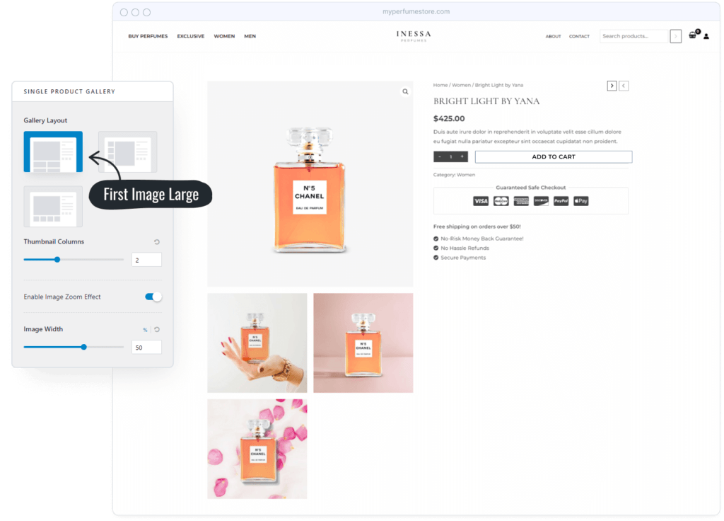
⭐️ Astra included a new ‘Sticky Add-to-Cart’ function to make the entire purchasing process as simple as possible.
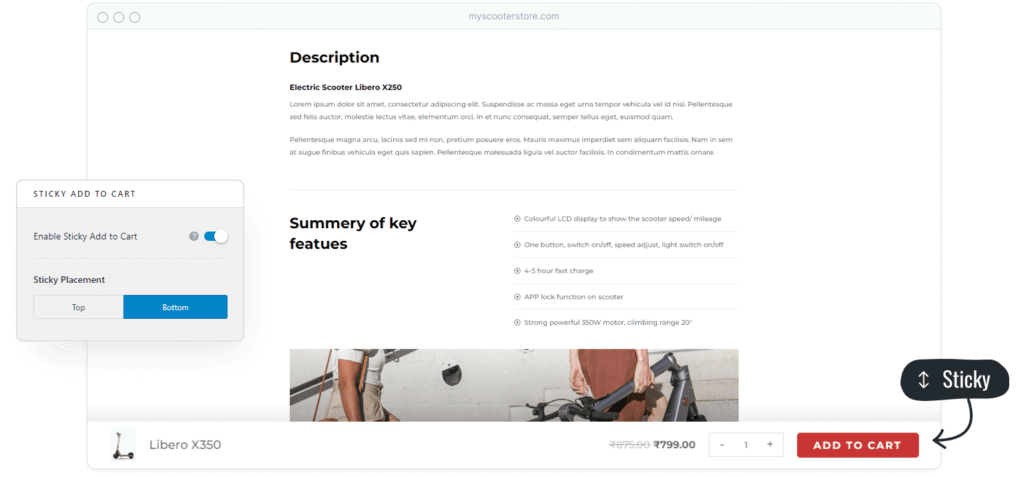
This feature keeps a “add to cart” button at the bottom of the product description page while you scroll through it. This feature can be easily enabled or disabled using your customizer.
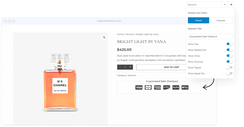
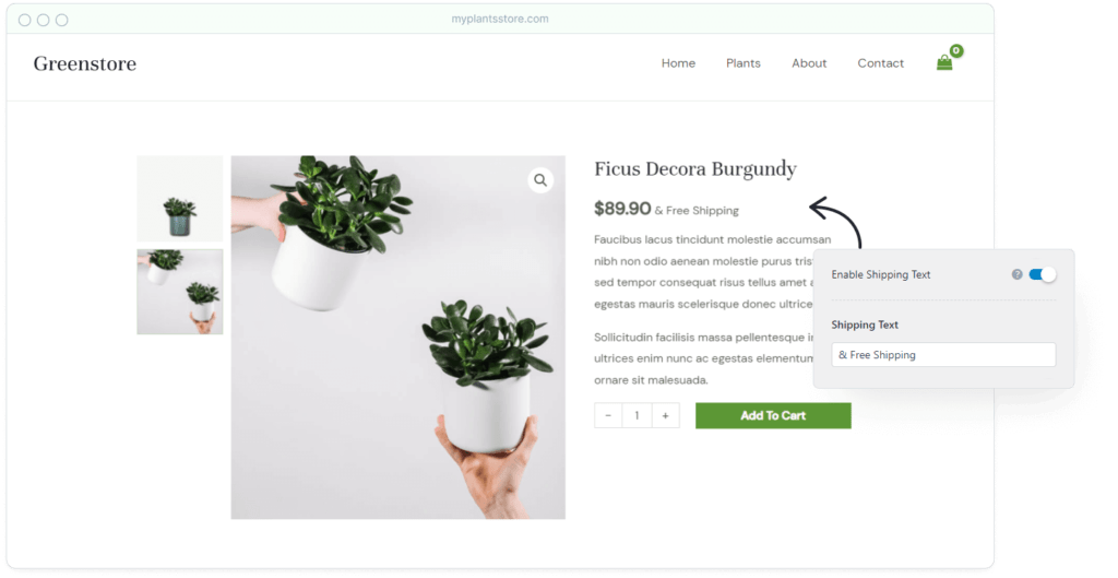
On the product page, Astra even included some psychological triggers like payment symbols and shipping information.
2.1 UI Improvement
In this Astra 3.9 release, Astra attempted to improve a number of elements. The product quantity selector is another area that has witnessed growth.
The default product quantity selector isn’t very appealing. It also does not look good on mobile devices.
New Look 😍
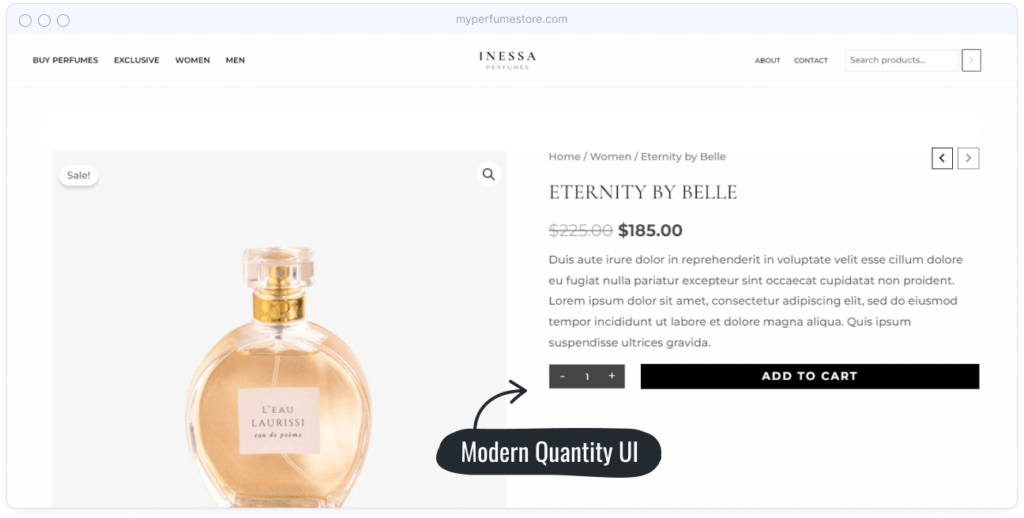
They focused on both aspects, and the outcome is a stylish amount selector that looks great on any screen size.
2.2 Modern Variations
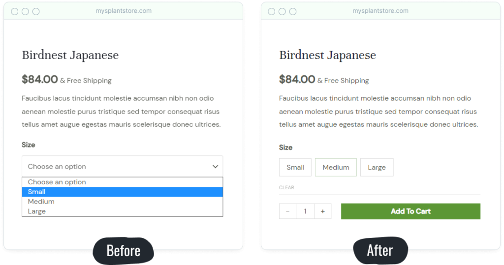
Astra 3.9 has also made significant improvements to product variations. Product variations can now be displayed as buttons rather than drop-down menus. This is not only good for UX, but it is also mobile-friendly.
3. Cart Page on Astra Pro Updates
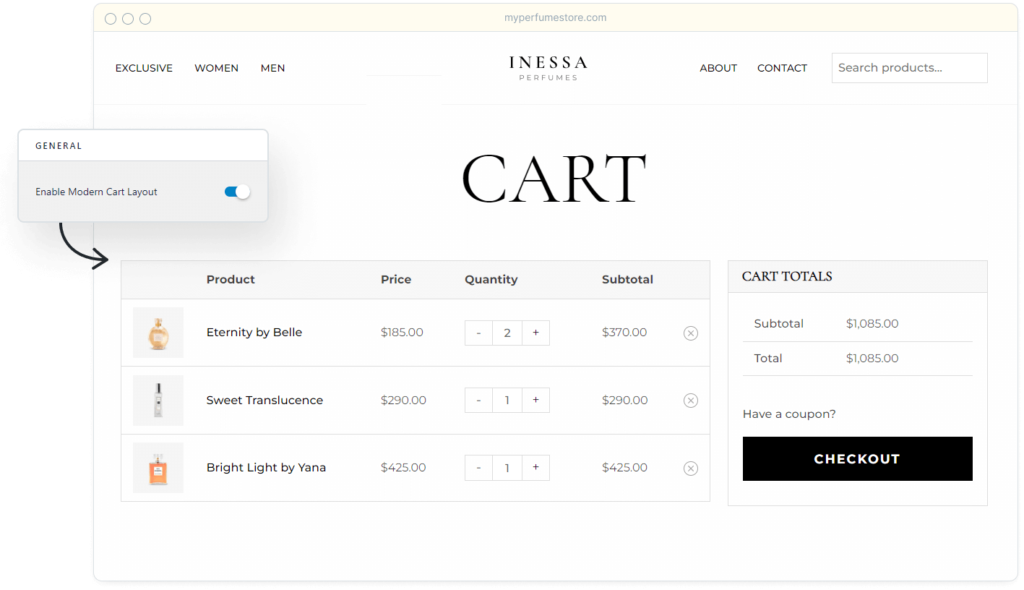
The cart page comes next. They also implemented great new improvements here.
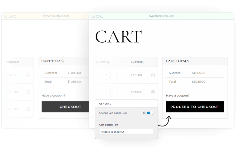
Astra added several additional changes to the user experience, including a modern new look, real-time quantity adjustments, a sticky cart totals sidebar, and the ability to customize the cart button text. Real-time quantity adjustments, Sticky cart totals sidebar, & Change the cart button text.
3.1 Off-Canvas Cart
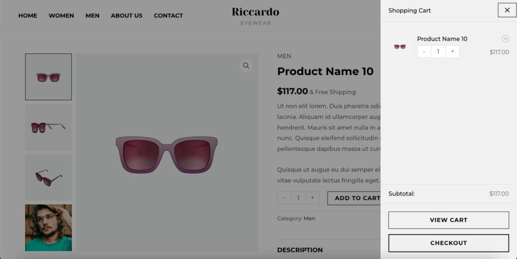
Wouldn’t it be nice to have a cart that slides out and keeps track of what you’ve bought? That is precisely what the new Slideout Cart feature achieves.
Rather than having a window pop up when you click on the cart, we’ve included a new slideout feature that displays all of the things you’ve placed in your cart. The slideout cart allows you to update your cart, see the cart, and proceed to payment.
4. Checkout Page on Astra Pro Updates
The checkout page is probably the most crucial page in your shopping cart. It can make or ruin a customer’s purchasing experience.
Did you know that the average cart abandonment rate across all industries is approximately 70%? This equates to approximately seven out of every ten clients abandoning their purchase.
Competing platforms, such as Shopify, offer simple, elegant checkout forms. WooCommerce, on the other hand, is frequently chastised for its lengthy and somewhat unintuitive checkout forms.
GOOD NEWS > ASTRA BRINGS NEW CHECKOUT INSPIRED BY SHOPIFY 😍
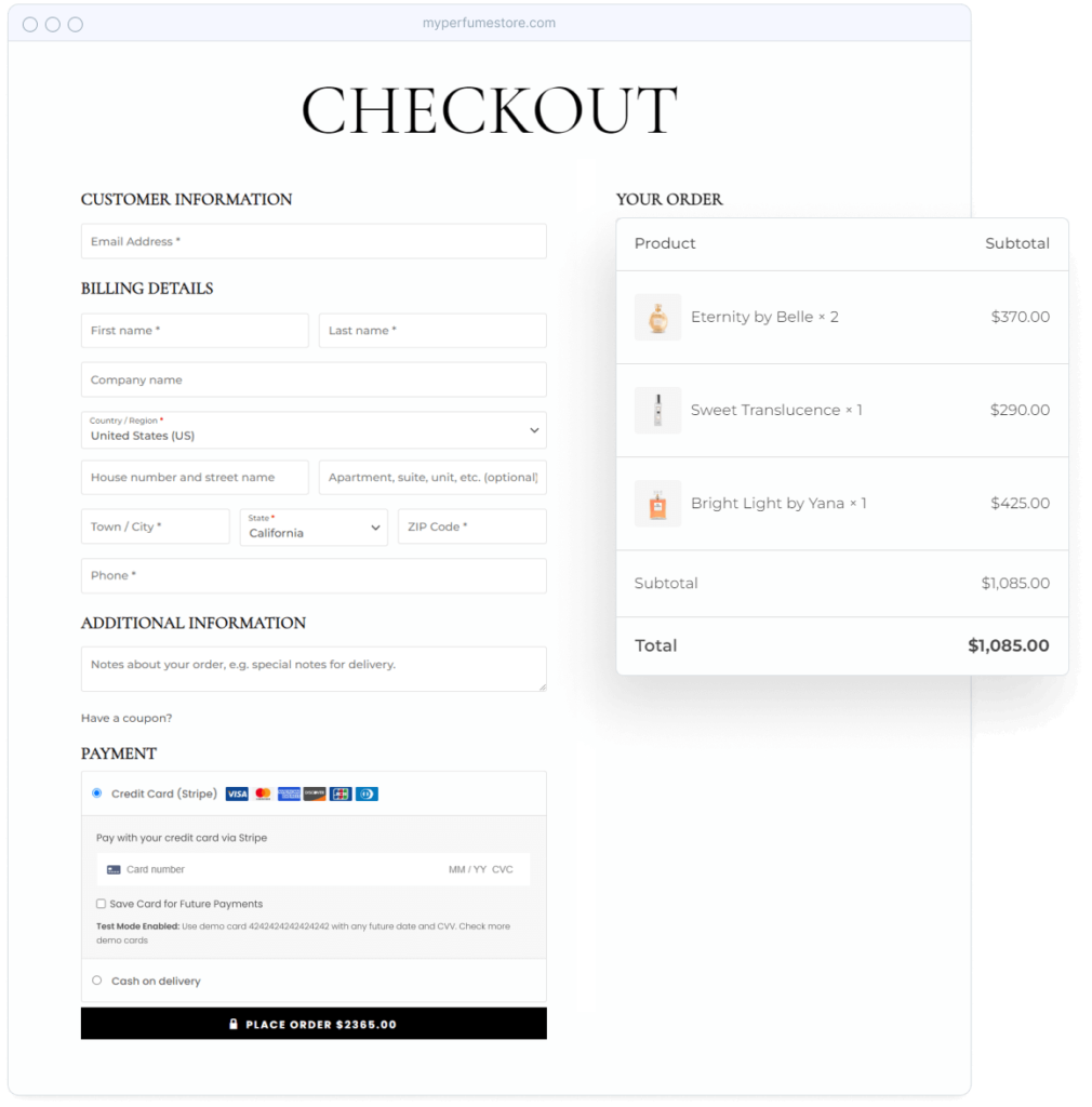
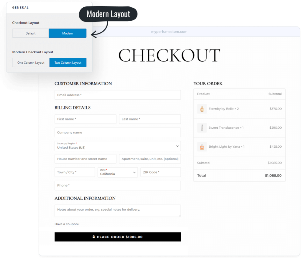
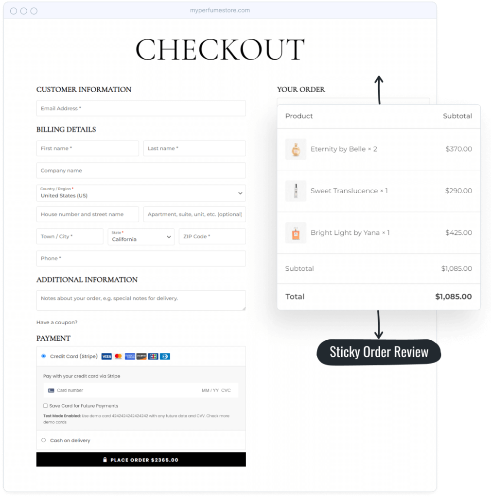
Modern Checkout is a whole new shopping experience. It beats the default WooCommerce checkout in every way.
- New modern appearance and feel
- Checkout is faster and easier.
- Optimized for increased conversion
Modern Checkout allows you to drastically improve the buying experience of your customers! An experience that encourages clients to go more quickly through the checkout process.
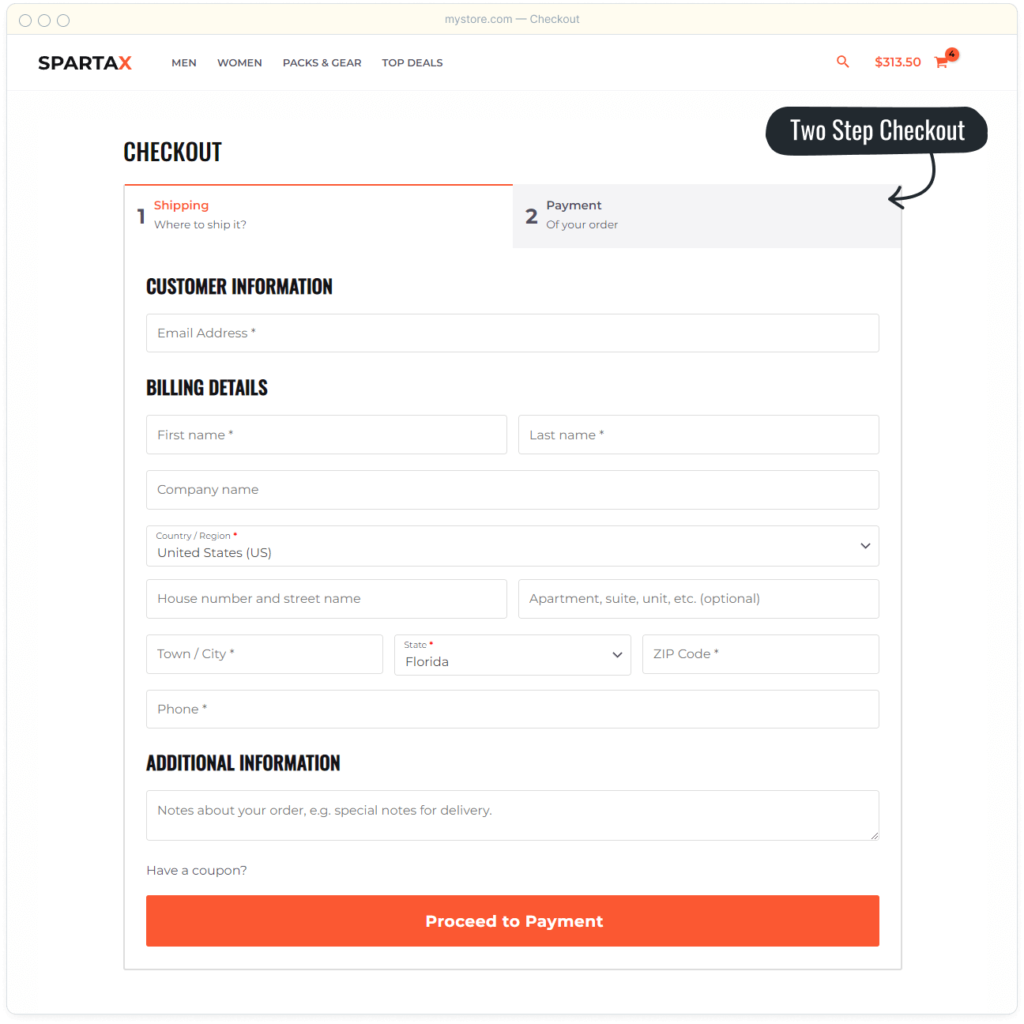
4.1 Two-step checkout
Astra also improved the two-step checkout layout, making it even more configurable.
5. Thank You Page on Astra Pro Updates
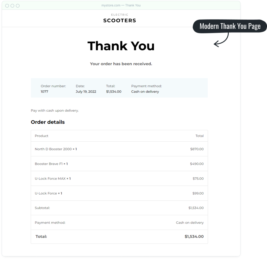
The customer is forwarded to the thank you page after completing the checkout process successfully. This page now has a more attractive and modern appearance.
6. My Account Page on Astra Pro Updates
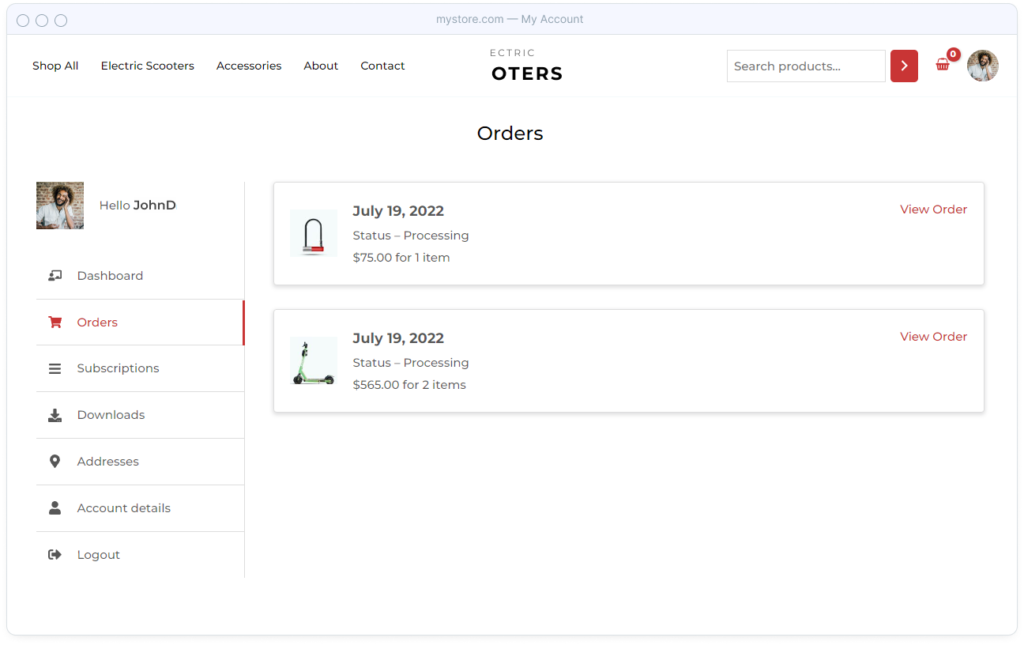
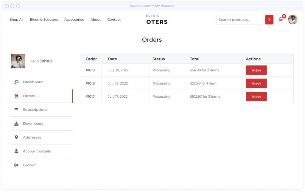
The “my account page” is a vital aspect of any online store because it is where customers can access all of their information. The “my account page” allows them to do everything from updating their billing information to tracking orders.
Customers that buy digital products can log in and download them from their account area.
All of this makes the account page an essential component of your store, one that must also be engaging to customers.
The account page in Astra PRO 3.9 now has a completely new, modern design.
