 Contact Support
 Categories
 All Items
 Themes
 Plugins
 Exclusive Deal
 Support
 Membership
 CHANGELOG
BricksExtras The Bricks Add-on 1.6.8
Recently Updated
100% Original Product & Well Documented
♥ Loved by Many!
0 sales
Version 1.6.8

GPL License
Original price was: $64.00.$3.99Current price is: $3.99.
- Verified from VirusTotal
- 100% Original Product and Virus Free.
- Free New Version Lifetime On Single Purchase.
- Unlimited Website Usage
- Price is in US dollars and included tax
Sale will end soon

SSL Secured Checkout


Verified From
- Products Are Purchased and Downloaded From Original Authors.
- The File is 100% Completely Untouched and Unmodified.
- Last Update: 19.Feb.2026
- Version: 1.6.8

Premium Membership
Download this product for FREE and also gain access to 5,000+ premium themes and plugins.

Secure Transaction
Your transaction is secure with the Stripe. One of the famous payment gateway
Virus Free
Our all items on our website are Virus free and tested with "McAfee Secure"
Timely Update
After publishing the new update from author we upload the latest file on our website
Product Description and Reviews
BricksExtras The Bricks Add-on Latest Version
This is a GPL-distributed version. No official support. Clean, secure, and legally redistributed under the GPL license.
The #1 element library for Bricks Builder. 33 advanced elements and many additional element features with a strong focus on both accessibility & flexibility to help expand your capabilities when building with Bricks.
+ Creative tools & features
This feature enables you to create floating effects for any element. Ideal for bringing the user’s attention to particular images/features or just creating more depth to the design.
This feature can be activated from the ‘interactive’ tab inside any native element. If adding to an image, it’s recommended to wrap in a div or block and instead add the functionality there.
Direction – Choose the direction that the element will move, either Horizontally or Vertically.
Duration – Set the speed of the animation by changing the overall duration. 6000ms is the default.
Distance – Set how far you want the element to move. Negative number will move it in the opposite direction. -20px is the default.
Delay – Adding delays helps you when you’re adding floating to multiple elements, but want them out of sync slightly.
Header Extras / Rows
BricksExtras adds more settings to the header template and a new ‘header row’ element to help you more easily build multi-row headers with support for adding overlay headers & sticky headers conditionally per page/template at different breakpoints. Header rows can be set to display or hide based on if the header is currently sticky or overlay.
Setting up Overlay & Sticky Headers Globally
Head to your header template and go to settings > template settings > header extras. Anything you set here will be the default globally, and then can be disabled or reconfigured per template/page if needed.
Setting up Overlay & Sticky Headers Per Page/Template
If the majority of the site doesn’t need an overlay or sticky header, it may make more sense to leave it disabled in the header template and instead set it up on the individual pages or templates where it’s required.
Go to either..
- settings > page settings > header extras
- settings > template settings > header extras
depending if you’re editing a template or an individual page. It’s the same process for disabling per page/template if you’ve already made it global.
Sticky Headers
The sticky headers in Header Extras settings is different to the native Bricks sticky header in a number of ways to make it more flexible..
- Can be set at a specific breakpoint and conditionally enabled/disabled per page/template.
- Supports use with overlay headers without needing to manually correct for top content padding.
- Hide at a certain scroll distance can be changed per page/template.
- Allows for different header rows to be conditionally hidden/shown when sticky or when overlay.
Parallax Scroll
This feature allows you to change the scroll speed of any elements across different devices. Ideal for adding more depth where elements can appear further away and closer to the reader as they scroll the page.
This feature can be activated from the ‘interactive’ tab inside any native element. If adding to an image, it’s recommended to wrap in a div or block and instead add the functionality there (or add a overlay to create a wrapper for the parallax).
How it works
You set the scrolling speed between -10 and 10. Zero being normal scroll. The higher the number, the more extreme the effect, so it’s generally recommended to stick to using low numbers.
A negative value will make it move slower than regular scrolling, and a positive value will make it move faster.
Example Use
If you don’t want elements to move around the page much, to preserve the layout structure, there’s also the option to contain the parallax inside of a container with overflow hidden.
Scroll speed – Set your scroll speed between -10 and 10. Numbers closer to zero will be more subtle, I recommend more subtle 🙂 Like with any styling added, the scroll speed is inherited across smaller devices but can be changed for smaller devices. By default, the mobile device is set to 0 and so the parallax effect is removed.
Popovers / Tooltips
Build custom popovers and tooltips. Supports nesting elements inside, being used inside of query loops and is out of the box responsive and accessible.
Overview
The popover element can be used in a few different ways, to cover many use cases.
Out of the box it consists of two parts, the ‘button’ or ‘marker’ which is the element that the user would interact with either by hovering/clicking or by keyboard (for eg see the green icons above in the image) and then the popover content, which is the content that pops up. Any elements can be nested inside of the popover content and can be used with dynamic data.
There’s also the option to use to add as tooltips, to any other elements on the page. This is for when you want the user to interact with other elements on the page, not the built-in button, for the popover to appear. See the ‘advanced’ settings.
Popover Content
The typography, colors, shadows, etc can all be styled from the popover content tab in the settings. If you’re nesting elements inside, then you are free to style each element however you like using the relevant style settings for that element.
Behaviour
Preferred Popup Placement – By default, the popup will appear where it has room to do so, the auto setting will ensure that across different devices there is always space. However, if you need to force it into a certain direction you can do with this setting.
User Interaction to Open – ‘Click’ ensures a click and tap will open the popup. If you’re wanting to open on hover, use ‘mouseenter click’, this way on desktop the hover will trigger it, but on mobile the user can still tap to open.
Offset Skidding – Change the position of the popover along the side of the element in which it will appear.
Offset Distance – Add spacing between the edge of the element and the popover position
Append to body – This option is ideal for situations where the popover is being added inside an area that either has overflow:hidden or a lower z-index than neighboring elements, and therefore is causing the popover to not be fully visible when opened. Enabling this setting will ensure the popover is always above all other elements on the page by moving the popover to the bottom of the page, while still positioning it correctly above the element it needs to.
Animation
Set the starting position of the popover to control the reveal animation. By default, the starting position is translateY of 10px and a scale of 0.95. This means the popover scales up and moves slightly upwards when revealed.
Tooltips
I’d recommend using the built-in button where possible, to open up the popover, as you then have the done-for-you accessibility and it’s relatively easy to get set up.
However, you can also use the element to dynamically add tooltips to other buttons/links etc on the page. Here you enable tooltip mode and then provide the selector of the elements on the page that should have a tooltip.
Use as tooltip – Set element to ‘tooltip’ mode, meaning it will be looking for other elements on the page for the user to interact with.
Element selector – Add the selector for the element(s) to be interacted with to show a tooltip. If wishing to use on multiple elements, the simplest way is to use a class, and add the same class to multiple elements.
Hide button in builder – Even with tooltip mode enabled, the button remains visible in the builder just so you can click it to style the popover content or add in new elements. Once you’ve set things up, you may wish to hide the button so it matches the front end (where there’s no button).
Tooltip Content
Dynamic tooltip text – If you wish to add tooltips to multiple elements, to make each element have it’s tooltip content, enable this setting and then head to your chosen element’s ‘Tooltip’ setting (in the style tab) to add content for that element specifically..
For example.. here we’re adding some manual content to a button element in the settings (making sure the button has the class to match the ‘element selector’ from the tooltip settings)
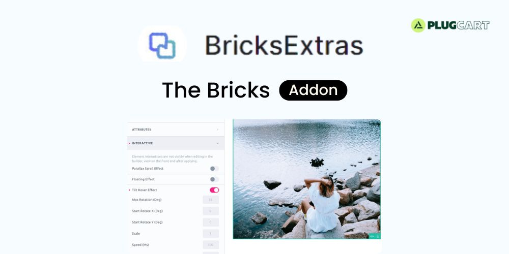
Tilt Hover
This feature allows you to add a tilt effect by hovering over the element. Nice effect for bringing attention on specific elements and another way to make the page feel more interactive, especially for elements that are clickable like large call to action buttons or linked images.
This feature can be activated from the ‘interactive’ tab inside any native element. If adding to an image, it’s recommended to wrap in a div or block and instead add the functionality there.
Max rotation – Maximum tilt rotation in degrees. (lower will give a more subtle effect, it’s unlikely to need anything higher than 15)
Start rotate X – Starting position rotation along the x-axis, if needing to rotate before the user hovers.
Start rotate Y – Starting position rotation along the y-axis, if needing to rotate before the user hovers.
Scale – Adds a scale along side the rotation when the user hovers. (2 = 200%, 1.5 = 150% etc)
Speed – Speed of the transition in ms
Perspective – The transform perspective ( the lower the more extreme the tilt gets ).
Glare – Enable glare effect as the element rotates. Set the max glare to control how extreme)
Disable tilt effect – Choose the viewporth width to disable the effect if wishing to remove for smaller devices.
Add a review
Currently, we are not accepting new reviews
Top Selling
Version 3.35.1

Original price was: $400.00.$3.99Current price is: $3.99.
2199 sales
Version 27.2

Original price was: $99.00.$3.99Current price is: $3.99.
816 sales
Version 3.21.0

Original price was: $249.00.$3.99Current price is: $3.99.
566 sales
Version 3.0.109
Original price was: $129.00.$3.99Current price is: $3.99.
531 sales
Version 8.4.1
Original price was: $59.00.$3.99Current price is: $3.99.
471 sales
Version 4.12.4

Original price was: $59.00.$3.99Current price is: $3.99.
369 sales
Version 12.7.5

Original price was: $59.00.$3.99Current price is: $3.99.
247 sales
Version 8.1.4

Original price was: $99.00.$3.99Current price is: $3.99.
244 sales
Related products
Version 5.0.4

Original price was: $99.00.$3.99Current price is: $3.99.
57 sales
Version 2.3.1

Original price was: $22.00.$3.99Current price is: $3.99.
21 sales
Version 3.6.9

Original price was: $59.00.$3.99Current price is: $3.99.
130 sales
Version 2.5.14

Original price was: $59.00.$3.99Current price is: $3.99.
6 sales
Version 1.44.1

Original price was: $169.00.$3.99Current price is: $3.99.
50 sales
Version 1.3.8
Original price was: $49.00.$3.99Current price is: $3.99.
0 sales
Version 2.12.17
Original price was: $57.00.$3.99Current price is: $3.99.
4 sales
Version 2.3.1.1

Original price was: $39.00.$3.99Current price is: $3.99.
5 sales
Version 1.12.14

Original price was: $199.00.$3.99Current price is: $3.99.
27 sales
Version 4.37.0
Original price was: $69.00.$3.99Current price is: $3.99.
10 sales
Version 3.35.1
Original price was: $400.00.$3.99Current price is: $3.99.
2199 sales
Version 3.21.0
Original price was: $249.00.$3.99Current price is: $3.99.
566 sales
Version 4.27.5

Original price was: $89.00.$3.99Current price is: $3.99.
19 sales
Version 4.27.0

Original price was: $66.00.$3.99Current price is: $3.99.
20 sales
Version 4.12.4
Original price was: $59.00.$3.99Current price is: $3.99.
369 sales
Version 4.20.0
Original price was: $99.00.$3.99Current price is: $3.99.
12 sales
Version 12.7.5
Original price was: $59.00.$3.99Current price is: $3.99.
247 sales
Version 3.5.16.1
Original price was: $22.00.$3.99Current price is: $3.99.
15 sales
Version 2.2.3

Original price was: $49.00.$3.99Current price is: $3.99.
68 sales
Version 3.23.4

Original price was: $49.00.$3.99Current price is: $3.99.
103 sales
Version 2.2.14

Original price was: $15.00.$3.99Current price is: $3.99.
12 sales
Version 3.20.5

Original price was: $59.00.$3.99Current price is: $3.99.
206 sales
Version 28.3.1

Original price was: $59.00.$3.99Current price is: $3.99.
116 sales
Version 1.9.15

Original price was: $99.00.$3.99Current price is: $3.99.
35 sales
Sorry, no reviews match your current selections
WINTER SALE OFFERS • GET 25% OFF ON 1 YEAR & LIFETIME MEMBERSHIP USE COUPON CODE: SPECIALDISCOUNT25 • BUY TWO GPL PRODUCTS AT JUST $6 USE COUPON CODE: BUY2 • GET 25% OFF ON 1 YEAR & LIFETIME MEMBERSHIP USE COUPON CODE: SPECIALDISCOUNT25 • BUY TWO GPL PRODUCTS AT JUST $6 USE COUPON CODE: BUY2 • GET 25% OFF ON 1 YEAR & LIFETIME MEMBERSHIP USE COUPON CODE: SPECIALDISCOUNT25 • BUY TWO GPL PRODUCTS AT JUST $6 USE COUPON CODE: BUY2 • GET 25% OFF ON 1 YEAR & LIFETIME MEMBERSHIP USE COUPON CODE: SPECIALDISCOUNT25 • BUY TWO GPL PRODUCTS AT JUST $6 USE COUPON CODE: BUY2 •

Reviews
There are no reviews yet